COLLABORATION
The feedback provided by peers, instructors, and self-evaluation helps create focus on the design decisions made for the brand. Collaborating through the combination of feedback and research conducted to make brand communication stronger.
Brand Messaging
At the beginning of the brand's development, the messaging had to be understood, including the overall voice and tone, look and feel, and service it provides. Establishing the brand messaging created a guideline to follow while making design decisions. For Interconnecteen, the need that the brand aimed to fulfill is affiliation. The brand's psychographic is for those who lack the opportunity or thrive on connecting with others. The brand provides the service and opportunity for the target audience to connect.
Brand Service
The target psychographic of the brand was established effectively based on the feedback provided by the instructor. The critique also focused on who the brand is targeting. However, more barriers need to be mentioned in the brand messaging outline. They need an understanding of why the target audience would need to utilize the service provided by the brand.
In other words, there has to be a differentiation between Interconnection and other brands, like simple social media. The feedback focuses on the brand's objective and why the target audience must utilize it. The feedback was appropriate because there had to be a focus on what type of service to provide that is unique for the target audience.
Target Audience Need
Peer-provided feedback suggested succorance, the need for nurturant care, and affection as a focus for the brand. Based on how the brand service will fulfill the needs of the audience. It fits with fulfilling the need for succorance rather than affiliation.
The feedback was appropriate because of the interpretation of the first draft messaging overview. Since it was a first draft, there needed to be more focus on the unique service the brand is providing. More clarification is needed on what the brand aims to fulfill for the target audience. The feedback had valid insight into what the brand could provide. The difference is that the target service was community socialization rather than a support group. The brand focuses on reflecting fun functions like a club rather than therapeutic social support, so the feedback should have been utilized.
However, the feedback provided help understand why there needed to be more focus on the brand messaging. It provides the correct wording so those who read about Interconnected can understand its service without question.
The feedback helped refine the brand messaging and overall personality, establishing the foundation of the design decisions. The design decisions aim to fulfill the need and create a unique brand. The brand messaging was condensed and more focused on how the target psychographic needs the brand's service.
Brand Theme
The first draft theme of Interconnecteen was colorful and trendy. The first draft's personality was diverse, sociable, and authentic. But not discriminative, disloyal, or greedy.
The feedback is appropriate because the theme is vague and does not inspire characteristics to build the brand. The influence of what is popular and trendy changes based on the number of people interested in them (Wonderoplolis, n.d.). It would have been difficult to fulfill the theme because trends tend to change as different things become popular for different people. The feedback suggested a superhero theme based on the first draft taglines.
The theme suggestion was then implemented into the brand theme and the look and feel development, resulting in a strong asset creation and communication of a brand personality. The brand personality developed into social, active, imaginative, diverse, and connective. The personality fits with the superhero theme and is a stronger visual communication device, especially for the target audience. Resulting in a brand that uses visually appealing colors and fun illustrated graphics.
Feedback was provided for the theme and brand personality. The feedback stated that the theme needs to be more specific. There needs to be support or direction for the brand.
The brand theme is essential for marketing because it is a part of the brand identity, defining the service the brand provides (VoxMagna, 2022). A theme helps the brand look visually appealing, giving direction for the brand assets and design decisions and supporting the brand's becoming more recognizable(VoxMagna, 2022). Along with developing the messaging, the theme is essential for creating the brand. The theme helps create assets that relate to one another and push the visual communication for the messaging toward its audience.
Brand Look and Feel
Once the theme was decided, the look and feel were developed. The brand's look and feel use bright colors to fit the voice and tone of the brand. The font choices reference the art style of comic books, fitting the superhero theme of the brand. The graphics chosen also reflect the comic book and pop art style.
Onlyness Statement & Look and Feel
The feedback from peers and the instructor stated that the look and feel at a glance fit well with the superhero theme established. It has a clear vision of the theme and overall aim of the brand. Establishing the theme and basing the visuals on it helped communicate the brand messaging powerfully. In the look and feel chart, the onlyness statement was also included.
Feedback also stated that the onlyness statement is too long and sounds too promotional and needs to be shortened
The onlyness statement needs more focus and is straightforward. The onlyness statement for the brand needs to be unique and express a service that no other brands provide (Davies, 2020). The onlyness statement developed for Interconnecteen was too repetitive and too long to capture interest.
Another suggested element is removing the photograph of all the hands put together in the middle. It needs to be consistent with the illustrated graphics used.

Another suggested element is removing the photograph of all the hands put together in the middle. It needs to be consistent with the illustrated graphics used.
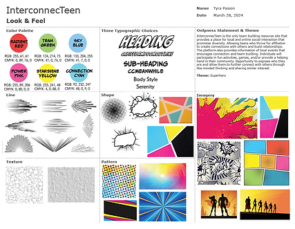
The feedback provided is appropriate and helps solidify the look and feel of the brand. Based on the feedback, the look and feel effectively communicate the theme and the brand values. The onlyness statement was rewritten to fit the voice and tone of the brand and address the brand's service and values straightforwardly. From the feedback, the graphic was removed from the look and feel of the brand.
The feedback helps improve the look and feel of the brand and develop the brand's vision board. The feedback given to the vision board was removing the word imagery because it was distracting compared to the directive words of the brand personality. Otherwise, there was a clear vision of the theme and overall aim of the brand. The feedback is valid because the word graphic and the words in the foreground had no contrast and were visually conflicted. The feedback provided assisted in making the look and feel of the brand more consistent and visually appealing. All while sticking to the established theme and messaging the brand expresses. Hence why, the changes were applied, and the final draft of the vision board evolved based on the assets created for the brand. They were removing assets inconsistent with the brand designs' decisions.
Brand Logo Development
Thirty sketches were created when developing the logo. Then, six logos were chosen and explored into more designs, reducing them to the final two and then the final logo design for the brand. All deductions are based on the feedback given.
30 Logo Sketches
Feedback from the instructor stated that the concepts were strong and had a clear direction—however, some of the logos needed to be legible on a smaller scale. The feedback provided is appropriate and helps determine what designs to omit from the next exploration.

30 Logo Sketches
6 Logo Sketches
The feedback for the six logo explorations states that the rationale for the six logo choices was well conducted. Each demonstrates a superhero theme. However, some of the third logo is nuanced, and the first logo is too similar to the Captain Planet logo (We Areplanetters, n.d.). The six designs are interesting, cohesive, and recognizable. The fifth design is busy and could be stronger as a wordmark.
The feedback given for the final two logos helped finalize the logo for the brand. The puzzle logo was omitted because the puzzle piece logo is reflective of the autism community (Autism Puzzle Piece Logo, n.d.). The planet and puzzle logos are similar because they are symbols associated with another organization or group, which will defeat the purpose of a brand logo. The logo represents the brand. It has to be unique, memorable, and separate from the competition (Goldring, 2024). If the logo is associated with another group, the brand will not be memorable or associated with the brand itself. This results in a need for more attraction towards the brand and its service. The feedback then provides the rationale for the final logo choice of the brand.


Logo Color Exploration
6 Logo Exploration

Final 2 Logo Designs
Brand Playbook
During the playbook's development, feedback was given during group discussions and through assessments, including peer-given assessments and self-assessments. The feedback covered the brand playbook's overall look and feel, voice and tone, visual hierarchy, and consistency.
Peer Evaluation
The peers who evaluated the Interconnected playbook stated that the playbook is consistent, clear, and matches the vision board of the brand. Using the brand's textures and shapes is effective and creates emphasis. The playbook's detail is manageable, and the colors contrast nicely. All while creating a visual harmony without visual conflicts. The voice and tone reflect the brand's personality and the superhero theme. The feedback also states that the playbook is put together and reinforces the brand's voice and tone. It is focused and could appeal to the target audience. It engages them with the use of bold colors and youthful images.
The feedback also states that the playbook is put together and reinforces the brand's voice and tone. It is focused and could appeal to the target audience. It engages them with the use of bold colors and youthful images.
The peer-provided evaluation helps solidify the efficiency of the brand playbook. It provides insights from both an audience perspective and a designer perspective on the visual communication of the brand playbook.
Self-Evaluation
Self-evaluations were also conducted throughout the process of the playbook design. The self-evaluations were conducted to understand what needs improvement while designing the playbook
Self-evaluations were also conducted throughout the process of the playbook design. The self-evaluations were conducted to understand what needs to be improved upon while designing the playbook.
The process is evaluating the look and feel, voice and tone, visual hierarchy, and consistency of the playbook based on an example of an effective playbook. Understanding what the end goal should be for the brand.
At the start, the aspects that needed the most improvement were the voice and tone and the overall layout of the playbook. The evaluation acted like a checklist to ensure all the important things were included in the playbook. The result of the self-evaluation is organizing the focus on the important elements of the brand and the playbook design.
Overall, the feedback and collaboration helped create a better understanding of the brand being developed, share ideas and make stronger design decisions, gain perspective from other points of view on the brand, and ensure it communicates the correct messages. Feedback and critique help measure the effectiveness of the brand and create a focus on brand development.
References
Autism puzzle piece logo. Autism Speaks. (n.d.). https://www.autismspeaks.org/autism-symbol
Davies, M. (2020, January 27). The ultimate proposition: The onliness statement. Mr Matt Davies. https://www.mrmattdavies.me/post/the-ultimate-proposition-the-onliness-statement
Goldring, K. (2024, February 7). 7 reasons why a logo is important to your business. Tailor Brands. https://www.tailorbrands.com/logo-maker/why-a-logo-is-important#:~:text=So%2C%20why%20is%20a%20logo,is%20expected%20by%20your%20audience.
VoxMagna. (2022, August 5). Why is having a brand theme important?. Medium. https://medium.com/@VoxMagna/why-is-having-a-brand-theme-important-28a1bb851e4e
We Are Planeteers. Captain Planet Foundation. (n.d.). https://captainplanetfoundation.org/
Wonderopolis. (n.d.). Why do fashions change over time? | Wonderopolis. https://wonderopolis.org/wonder/why-do-fashions-change-over-time